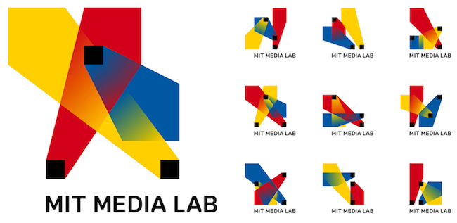
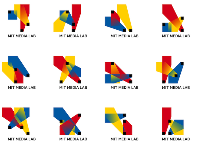
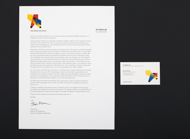
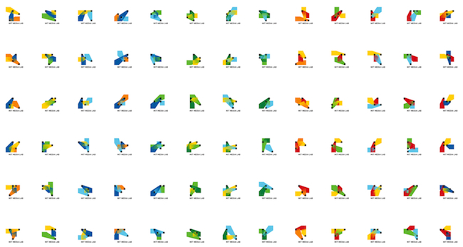
An algorithm can create 40,000 logo shapes in 12 different color combinations, providing the Media Lab an estimated 25 years worth of personalized business cards.
To honor 25 years of backseat-driving robots and vision-scanning iPhones and touchscreen-keyboard-3-D-display hybrids, the MIT Media Lab tapped Brooklyn-based designers (and erstwhile Media Lab rats) E Roon Kang and Richard The to dream up a fresh visual identity. The result is pure, unadulterated Media Lab: an algorithmic logo that generates a sui generis image for each of the Lab’s sui generis brains. (Cue spazzo nerd gasp.)It’s darn clever stuff. As The tells Co.Design, the Media Lab never really had its own logo. “There were identity components designed by Jaqueline Casey [in 1984] referencing the original [Media Lab] building by I.M. Pei,” he says. “It features a nice colorful mural by Kenneth Noland. But there never was an actual logo per se.” The algorithmic design represents the Media Lab’s first official stab at a coherent identity, and it’s high time. The Lab has transformed from a scruffy operation focused on quaintly enhancing the “digital revolution” into a full-blown brand synonymous with wild experimentation, collaboration, and big-time math geeks. Now, it’s got the graphic design to match.
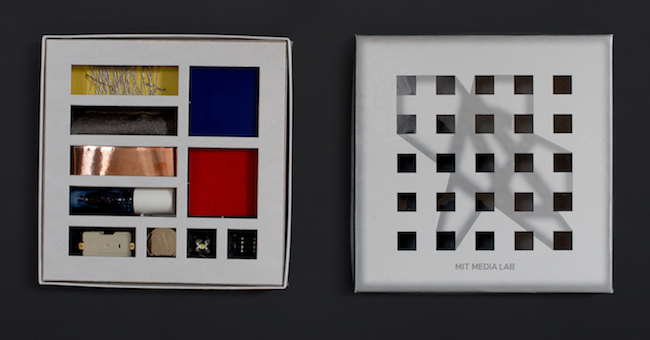
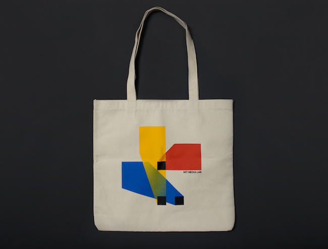
The basic idea here is that the logo has three intersecting spotlights that can be organized in any of 40,000 shapes and 12 color combinations using a custom algorithm. That’s enough to supply each and every new card-carrying Media Labber with his very own logo for a whopping 25 years.
VIDEO

Δεν υπάρχουν σχόλια:
Δημοσίευση σχολίου